
Walk up to a car built a couple of decades ago and the badge is probably the first small piece of craftsmanship you touch. It’s a chrome-plated, beveled little sculpture set into the grille or pressed into the trunk lid, made to catch sunlight and shrug off road salt, stone chips, and the automatic car wash. Its job was simple: look impressive from a few feet away, on a car, in daylight.
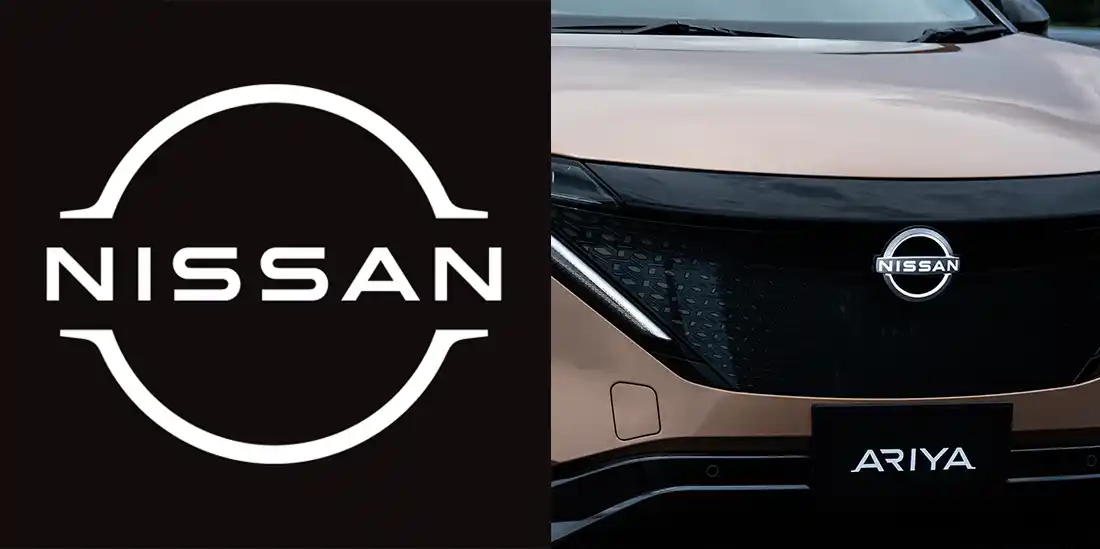
That brief has grown. The same emblem may now need to sit on a tailgate, shrink to an app icon, greet you on an infotainment screen at start-up, and glow against a dark front end at night. Nissan framed its 2020 redesign as adapting a physical badge for the digital world, with an illuminated version planned for its all-electric models.
Electric vehicles didn’t create that pressure on their own, but they are where it’s easiest to see. The short answer to what’s changing is that logos are getting simpler, flatter, and more adaptable. The more interesting answer is that they’re starting to behave less like marks and more like systems, and that looking futuristic is harder to pull off than it seems.
Nissan Logo Rebranding
From Metal Emblems to Digital Symbols
For most of automotive history, a badge was a physical object first and a graphic second. Chrome, enamel infill, beveled edges, and raised lettering gave it presence in natural light, and the flat version on a brochure was essentially a picture of the metal. Simulated depth becomes a problem when that picture has to travel. A gradient that looks rich at the size of your fist turns to mush at the size of a fingernail, and it fights with whatever background a screen puts behind it.
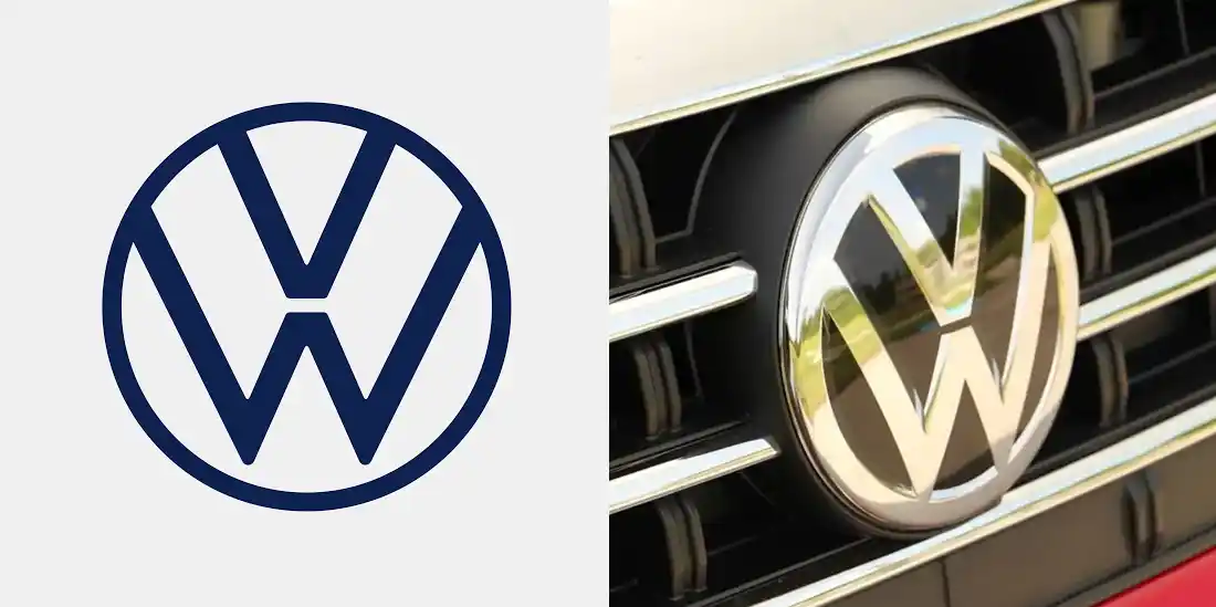
Volkswagen made the shift explicit in 2019. At the Frankfurt show it unveiled a flat, two-dimensional logo alongside the all-electric ID.3, describing it as reduced to essential elements and built for flexible use in digital media. The changeover involved roughly 70,000 logos at 10,000 dealer and service sites.
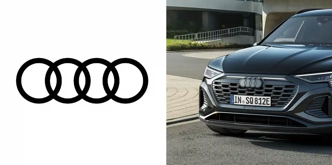
But the story is more layered than “EVs killed chrome.” Audi’s brand strategist says its two-dimensional rings originated in 2016 as a response to digitalization. On the cars themselves, they didn’t appear until later, with the Q8 e-tron as the first model to carry them. The screen came first, and the electric SUV gave the flat version its first physical home.
That’s the real point. This isn’t simply “EV design.” It’s the convergence of electrification and digitalization. When a car is as much a software platform as a machine, its central symbol has to look native to both.
Volkswagen Logo Rebranding
Why EVs Favor Simpler, Cleaner Logo Design
Look at what changed on these badges and four qualities keep surfacing: fewer details, flat construction, tighter geometry, and forms that can flex.
Audi’s rings show the first two. The geometry is almost identical to before, but the chrome is gone, replaced by a high-contrast black-and-white treatment with a thin black border that keeps the badge consistent whatever the paint or grille color. Geometric precision gives a mark the feel of engineering rather than ornament, the kind of clean proportion that sits comfortably next to a software interface.
The fourth quality, responsiveness, is where lighting enters. Nissan’s design chief gave his team the keywords “thin, light and flexible,” and they had to work out the outline thickness that would look crisp when lit. Cadillac made a similar move, introducing a monochromatic crest that was reportedly optimized to look cleaner and more recognizable when backlit.
None of this is exclusive to electric cars, and it would be a mistake to treat it as a rule. Mini flattened its logo in 2018. BMW’s transparent 2020 roundel debuted on an electric concept, yet the company said it was for communications only and that the existing badge would stay on its cars. A better reading is that EV launches and EV-focused redesigns give these choices a reason and a stage.
Audi Logo Rebranding
Illumination Changes What an Automotive Logo Can Be
On a combustion car, the front end was organized around airflow. The big grille fed the radiator, and the badge sat in the middle of it, catching whatever daylight fell on it.
Electric cars still need cooling, but they need it differently. Lexus says its RZ, with no engine to cool, has a low hood and a minimal grille opening, and the brand’s spindle grille gives way to what it calls a Spindle Body. What was an opening becomes a surface, and increasingly a surface full of sensors. The Cadillac Lyriq’s black “grille” houses radar units. Polestar’s Precept concept swapped the grille for a SmartZone that gathers camera and radar sensing in one place.
That surface gives the badge a different kind of stage. Instead of reflecting light, it can emit it. Nissan’s EVs carry an illuminated logo lit by 20 LEDs, one for each year between redesigns, and the team drafted the illuminated badge first, then pulled the lit area out to create the flat two-dimensional version. In effect, Nissan’s flat logo was derived from a light. On the Lyriq, the welcome sequence begins with the crest, then cascades across the shield, headlamps, and door handles. Polestar lights the badge on the nose of the Polestar 4 from below. Volkswagen saw this coming when it declared, “Light is the new chromium.”
A chrome badge is a static object. A lit one is a signature. It can wake up as the owner approaches and take part in a choreography, so it reads as part of the car’s interface rather than an ornament bolted to it. It also comes with constraints chrome never had: Nissan’s designers had to account for government regulations on illuminated elements. Light becomes another branding medium, with its own rules.
Audi Logo Rebranding
The Rise of the “Future Mobility” Logo
Logos carry a message, and the message is changing. Automotive marks have long leaned on heritage, speed, strength, prestige, and mechanical performance. The identities being drawn now have to hold a wider set of ideas: technology, connectivity, sustainability, mobility services, and a tone that feels less mechanical and more human.
Kia is the clearest case because its own explanation goes well beyond looks. In 2021 it dropped the oval that had long enclosed its name in favor of a futuristic nameplate. Kia ties the new logo to a direction beyond automobiles and toward sustainable mobility, and describes it through three ideas: symmetry, rhythm, and rising. The last shows up as diagonal strokes that echo the meaning of “Ki,” to rise. The old oval had, over the years, accumulated dimensionality and gradients. The new mark has neither.
Nissan tells a similar story. It describes moving from a hard-edged, industrial feel to something refined and digital-friendly, signaling a shift from traditional manufacturer to provider of mobility and services. Notice what’s being traded. A mark that once said “we build machines” is now asked to say “we run an ecosystem, and it’s approachable.” Whether a logo can carry all that, or just looks tidier, is the harder question.
What EV-Native Brands Are Doing Differently
Established automakers redesign with a century of history looking over their shoulder. EV-native brands were born without it. Their marks show what a different starting point does, though “blank canvas” oversells it.
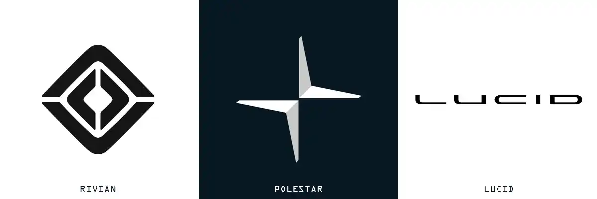
Tesla’s is the archetype. Elon Musk confirmed in 2017 that the T represents the cross-section of an electric motor, and the logo, designed by RO Studio, began life inside a shield that was eventually dropped. It’s a badge whose logic comes from the drivetrain rather than from crests and heraldry. Polestar’s is pure geometry. Two chevrons pointing at each other form a four-pointed star, a nod to the Pole Star, with no lettering. Rivian went narrative. Its mark is inspired by a compass, and its four arrows stand for the values behind the company’s decisions. Lucid pairs a horizontally stretched uppercase wordmark in a custom sans-serif with a California grizzly that appears on headrests, in the interface, and on the wheel center caps of some models.
So do EV-native companies have more freedom? Yes, but the results argue against a single “EV look.” Tesla’s mark is a diagram, Polestar’s a piece of geometry, Rivian’s a story, and Lucid’s a two-part system that deliberately adds warmth to minimalism. What they share is the assumption that identity must work across screens, surfaces, and light from day one. They also pay a cost heritage brands don’t: with no decades of exposure to lean on, recognition has to be earned from scratch.
EV Maker Rivian, Polestar, Lucid Logos
The Challenge: Looking Futuristic Without Looking Generic
Here’s the awkward part. As automotive identities converge on flat vectors, restrained sans-serif type, and monochrome finishes, there’s a real risk they start to look interchangeable. Simplification improves usability, but it can also strip out the character that let you tell one brand from another at a glance.
The tension plays out in four places: modernization versus distinctiveness, minimalism versus personality, technology versus warmth, and sustainability versus cliché. Kia’s experience illustrates the first two. Its connected letterforms and a lowercase-style “A” with no crossbar led many people to read the logo as “KN.” Autoblog reported around 30,000 monthly searches for “KN car.” Call it a stumble or an accidental publicity win, but it underlines a basic point: a logo has to be read before it can be admired.
Geometric simplicity doesn’t guarantee uniqueness either. Polestar’s chevron star ended up in a French legal dispute with Citroën, a brand famous for its chevrons. A court sided with Citroën on trademark in 2020, and the two settled in 2022. Even a blank slate has neighbors.
Then there’s the lazy shortcut: signaling “electric” with a lightning bolt, a circuit-board pattern, a wash of neon blue, or a green leaf. These devices describe the powertrain, not the brand, and they tie a logo to a moment. Compare Tesla’s T, which references a motor but works as a letter, or Lucid’s bear, which says nothing about batteries and a lot about where the company comes from. Minimalism isn’t the removal of detail. It’s the discipline of deciding which details deserve to stay.
The Logo is Becoming a System, Not Just a Mark
Zoom out and the logo stops being the whole story. An automotive identity now spreads across the exterior badge, an illuminated emblem, the wordmark and typeface, motion, the app and infotainment interface, the dealership, and increasingly the charging experience.
The major rebrands show it. Nissan’s logo comes in four iterations to suit different communication points, from letterhead and dealership signs to social media, and in video it’s meant to shift and pulsate against different backgrounds. Volkswagen added a “moving frame” to position its logo flexibly in digital interfaces, and gave the brand a sound logo for the first time. BMW solved it with two marks: a transparent one for communications, and the existing badge for the car. Audi wants its rings to look the same on a car, a virtual cockpit, a smartphone, or a billboard, and the redesign was led by the head of its interface department, which says something about where a logo now lives.
For designers, the checklist has changed. Does it work at two inches and at twenty feet? In monochrome? On a dark interface? Can it be animated without losing its shape, manufactured as a physical badge, and lit? And does it still feel like the same brand in every one of those places? “Does it look good on a car?” is now the easy question.
The identity doesn’t end at the dealership door, either. Owners make their own choices about how a vehicle presents itself, from trim finishes to exterior lighting to protective film. For readers curious how far exterior personalization goes in practice, EV Devil is one resource that catalogs EV styling and trim, lighting, and paint protection options.
What Comes Next?
None of this requires a crystal ball. The directions are already visible. Logos are gaining motion, from Nissan’s pulsing video mark to the Lyriq’s welcome sequence. Lighting is being integrated into the front end rather than added to it. Marks are being designed for physical and digital use at the same time, as when Nissan drafted its lit badge first. Software and interface teams are taking a bigger role in identity. And identities are being stretched across more than cars: Kia says its logo unifies the brand across vehicles, services, and every customer touchpoint.
The open question is discipline: how much motion and light a mark can absorb before it loses its shape. Constraints like the lighting regulations Nissan had to navigate will keep that honest.
Conclusion: Electrification Is Changing More Than the Powertrain
The biggest change may not be that EVs require different logos. It’s that the automotive brand is no longer confined to the car.
The emblem that once had one job, looking good on a grille, now has to perform as a badge, a light, an app icon, an interface element, and a signal for a broader mobility ecosystem. The brands that get it right won’t necessarily be the flattest or the most obviously “electric.” They’ll be the ones whose marks stay recognizable when everything around them changes: the size, the surface, the medium, even the light. That’s what a good logo has always been asked to do. It just has far more places to do it now.